PE Ratio Predicts Returns
Common wisdom is that index funds outperform managed investments over the long term, because market efficiency gives no advantage to judgment. Right? Well… generally. But here’s an illustration of how one simple, basic judgment can provide superior returns.
Below is a 125-year history of the S&P500 index (or, prior to 1926, its large-cap equivalent), rendered as a set of monthly 20-year periods. Each point in the graph shows a 20-year compound return versus the PE10 ratio of the index (price divided by the 10-year trailing average of earnings plus dividends) at the beginning of that period.
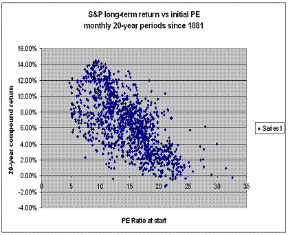
The implication is that you can estimate — very roughly — the 20-year future return of the S&P500 based on just one piece of information: its PE ratio today.
As you can see — and subject to potential statistical biases below — the graph appears to show that if you invest in index funds when their aggregate PE ratio is greater than about 20, you should have low expectations about the result.
More ominously, the graph shows that, over the past 125 years, if you purchased an index fund with a PE of at least 24, and held it for 20 years, you would rarely have made more than 3% per annum. I say “ominous” because the S&P index is that expensive right now.
How can you apply this to money management? One way might be to hold more short-term Treasuries when the index looks too expensive. Let’s look at how that strategy might have performed over the past century.
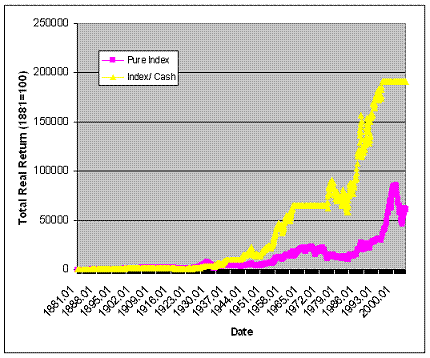
The pink line shows the real, inflation-adjusted result of simply holding the S&P 500 for 125 years. The yellow line shows the real result of buying the index whenever its PE ratio is less than 9, and selling it (going to Treasuries) whenever the index PE ratio is greater than 22. (This chart makes one big simplifying assumption, namely that the risk-free rate is the same as the inflation rate, i.e. the real return on Treasuries is zero. I don’t believe this detracts from the conclusions.)
As you can see, the PE-based asset allocation strategy resulted in a much better total return. The advantage varies, but generally exists for any long period over the past 125 years.
Note also that, under this strategy, you would automatically have sat out the crashes of ‘29, ‘37 and ‘74, with no false positives.
Now for the hard part: you would have spent years sitting on the sidelines. The 1960’s, for example. Perhaps most of your working life. Many people would prefer to play “the only game in town,” even if it’s rigged against them.
Another little problem, at least if you’re an investment manager, is that this strategy required only 9 trades in 125 years! Hard to charge your advisees 1% per year for that kind of advice!
Academically, there is the little problem that this graph flies in the face of modern portfolio theory in general, and the capital asset pricing model (CAPM) in particular. CAPM, as any MBA will attest, says that over the long term, the more risky asset (index alone) should outperform the less risky one (index plus cash). Here we have a 125-year timeline suggesting otherwise.
Why the difference from CAPM? Because CAPM assumes that assets are always priced rationally in relation to their risk. If whole asset classes can become overpriced relative to their long-term return (as appears periodically to be the case with stocks), and if you can identify that fact, then CAPM breaks down.
Another problem is practical: this model has been screaming “go to cash” since June 1995. Let’s say you’re 40 years old today. Based on the first chart above, index funds appear likely to offer a real return of 3% for the rest of your working life. Research shows that mutual funds and hedge funds generally do worse than index funds.
And, finally, there is a less obvious problem: this latter graph shows the result of lump-sum investing, rather than dollar-cost averaging over time, which is what most people do. It turns out that dollar-cost averaging into the index DOES beat market timing over most long periods.
I think the right conclusions to draw from this are as follows:
1. Buying low PE results in much higher return than buying high PE.
2. Dollar cost averaging is more powerful than market timing, even in the long term.
How does this translate into an investing strategy for today’s expensive markets? See the next article for more.